Send 2500 USDC
1 of 2
Send 2500 USDC to 0xA11CE00000000000000000000000000000000A11
- Your Pecu wallet0x1234…5678Waiting
- Alice0xA11C…0A11Signed
- Bob0xB0B0…0B0BWaiting
Needs 1 more approval. Executing from an owner wallet counts as its approval.
Amber-minimal colors and type. Pecu’s clay surfaces and original 3D snail.

One shared theme, with soft edges, inset highlights and tactile controls.
The original amber-minimal tokens, consumed by both products. Select a swatch to copy its value.
| Token | Value |
|---|---|
--font-sans | Inter, sans-serif |
--font-mono | JetBrains Mono, monospace |
--font-serif | Source Serif 4, serif |
--radius | 0.375rem |
--tracking-tighter | calc(var(--tracking-normal) - 0.05em) |
--tracking-tight | calc(var(--tracking-normal) - 0.025em) |
--tracking-wide | calc(var(--tracking-normal) + 0.025em) |
--tracking-wider | calc(var(--tracking-normal) + 0.05em) |
--tracking-widest | calc(var(--tracking-normal) + 0.1em) |
--background | oklch(1.0000 0 0) |
--foreground | oklch(0.2686 0 0) |
--card | oklch(1.0000 0 0) |
--card-foreground | oklch(0.2686 0 0) |
--popover | oklch(1.0000 0 0) |
--popover-foreground | oklch(0.2686 0 0) |
--primary | oklch(0.7686 0.1647 70.0804) |
--primary-foreground | oklch(0 0 0) |
--secondary | oklch(0.9670 0.0029 264.5419) |
--secondary-foreground | oklch(0.4461 0.0263 256.8018) |
--muted | oklch(0.9846 0.0017 247.8389) |
--muted-foreground | oklch(0.5510 0.0234 264.3637) |
--accent | oklch(0.9869 0.0214 95.2774) |
--accent-foreground | oklch(0.4732 0.1247 46.2007) |
--destructive | oklch(0.6368 0.2078 25.3313) |
--destructive-foreground | oklch(1.0000 0 0) |
--border | oklch(0.9276 0.0058 264.5313) |
--input | oklch(0.9276 0.0058 264.5313) |
--ring | oklch(0.7686 0.1647 70.0804) |
--chart-1 | oklch(0.7686 0.1647 70.0804) |
--chart-2 | oklch(0.6658 0.1574 58.3183) |
--chart-3 | oklch(0.5553 0.1455 48.9975) |
--chart-4 | oklch(0.4732 0.1247 46.2007) |
--chart-5 | oklch(0.4137 0.1054 45.9038) |
--sidebar | oklch(0.9846 0.0017 247.8389) |
--sidebar-foreground | oklch(0.2686 0 0) |
--sidebar-primary | oklch(0.7686 0.1647 70.0804) |
--sidebar-primary-foreground | oklch(1.0000 0 0) |
--sidebar-accent | oklch(0.9869 0.0214 95.2774) |
--sidebar-accent-foreground | oklch(0.4732 0.1247 46.2007) |
--sidebar-border | oklch(0.9276 0.0058 264.5313) |
--sidebar-ring | oklch(0.7686 0.1647 70.0804) |
--shadow-color | hsl(0 0% 0%) |
--shadow-opacity | 0.1 |
--shadow-blur | 8px |
--shadow-spread | -1px |
--shadow-offset-x | 0px |
--shadow-offset-y | 4px |
--letter-spacing | 0em |
--spacing | 0.25rem |
--shadow-2xs | 0px 4px 8px -1px hsl(0 0% 0% / 0.05) |
--shadow-xs | 0px 4px 8px -1px hsl(0 0% 0% / 0.05) |
--shadow-sm | 0px 4px 8px -1px hsl(0 0% 0% / 0.10), 0px 1px 2px -2px hsl(0 0% 0% / 0.10) |
--shadow | 0px 4px 8px -1px hsl(0 0% 0% / 0.10), 0px 1px 2px -2px hsl(0 0% 0% / 0.10) |
--shadow-md | 0px 4px 8px -1px hsl(0 0% 0% / 0.10), 0px 2px 4px -2px hsl(0 0% 0% / 0.10) |
--shadow-lg | 0px 4px 8px -1px hsl(0 0% 0% / 0.10), 0px 4px 6px -2px hsl(0 0% 0% / 0.10) |
--shadow-xl | 0px 4px 8px -1px hsl(0 0% 0% / 0.10), 0px 8px 10px -2px hsl(0 0% 0% / 0.10) |
--shadow-2xl | 0px 4px 8px -1px hsl(0 0% 0% / 0.25) |
--tracking-normal | 0em |
--radius-sm | calc(var(--radius) - 2px) |
--radius-lg | calc(var(--radius) + 4px) |
--radius-xl | calc(var(--radius) + 8px) |
--dark | oklch(0.2046 0 0) |
--dark-foreground | oklch(0.9219 0 0) |
--dark-card | oklch(0.2686 0 0) |
--dark-muted-foreground | oklch(0.7155 0 0) |
--dark-border | oklch(0.3715 0 0) |
--ease-out | cubic-bezier(.23, 1, .32, 1) |
--ease-in-out | cubic-bezier(.77, 0, .175, 1) |
--fast | 160ms |
--tile | 480ms |
--stagger | 60ms |
--card--accentOnly the homepage Aero tile uses Aero’s palette. The values come from the Aero TUI, and design:check fails when they drift.
The same theme and clay material applied to conversation, inputs and transaction previews. These samples only change local state.
| Token | Value |
|---|---|
--clay-radius-control | 14px |
--clay-radius-surface | 22px |
--clay-radius-large | 30px |
--clay-radius-pill | 999px |
--clay-light | color-mix(in oklch, var(--background) 85%, transparent) |
--clay-shade | color-mix(in oklch, var(--foreground) 12%, transparent) |
--clay-shadow | 8px 10px 22px var(--clay-shade), -6px -6px 18px var(--clay-light),
inset 2px 2px 3px var(--clay-light), inset -3px -3px 6px var(--clay-shade) |
--clay-shadow-sm | 4px 5px 12px var(--clay-shade), inset 1px 1px 2px var(--clay-light),
inset -2px -2px 4px var(--clay-shade) |
--clay-shadow-primary | 5px 6px 14px color-mix(in oklch, var(--primary) 24%, transparent),
inset 2px 2px 4px color-mix(in oklch, var(--primary) 45%, var(--background)),
inset -3px -3px 5px
color-mix(in oklch, var(--primary) 72%, var(--foreground)) |
--clay-shadow-inset | inset 1px 2px 5px var(--clay-shade) |
--clay-focus | 0 0 0 3px color-mix(in oklch, var(--ring) 40%, transparent) |
--clay-hover | color-mix(in oklch, var(--primary) 88%, var(--background)) |
ABC120ABC120ABC120ABC120Sample error. Check transaction status before retrying.
ABC120ABC120ABC120ABC126ABC126ABC126ABC126Sample error. Check transaction status before retrying.
ABC126ABC126ABC126ABC124ABC124ABC124ABC124Sample error. Check transaction status before retrying.
ABC124ABC124ABC124Each preview lists the transactions it will sign, decoded from the exact calls, and draws where the tokens go. Numbers on the route match the list. Point at a transaction to highlight its part of the route. The route animates only while the plan waits for a decision.
ABC12DABC12DABC12DABC12DSample error. Check transaction status before retrying.
ABC12DABC12DABC12DABC12EABC12EABC12EABC12ESample error. Check transaction status before retrying.
ABC12EABC12EABC12EFictional example. No wallet, quote or transaction is connected.
Signed cohort flows, realized and unrealized P&L, and separate wallet and DeFi exposure. Explore the Nansen showcase.
Odds, order books, leaderboards and trader P&L from public Polymarket reads. Explore the Polymarket showcase.
Hovering the wallet address shows this card. Clicking the address opens the full P&L page with 7-day, 30-day, 90-day and 1-year periods.
+$160.00
Data: Nansen · 2 min ago
Each pending Safe transaction shows its approval beads, every owner's status and only the actions the viewer's wallets can take. Pecu wallet actions open the same transaction preview; a connected wallet signs or executes directly.
Send 2500 USDC to 0xA11CE00000000000000000000000000000000A11
Needs 1 more approval. Executing from an owner wallet counts as its approval.
Wallets the person holds, each linked with a signed message. The switch menu beside the wallet address sets which wallet a thread reads and prepares transactions for, and that wallet signs its previews.
Choose the source wallet, destination, token and amount. Review opens the existing confirmation card. This specimen uses fictional balances.
Transfer between your wallets on Base.
Available: 5.907128 USDC
Keep amounts readable and the next action clear.
| Rule | Pecu | Pecu Agent |
|---|---|---|
| Font | Inter with system fallbacks | Inter with system fallbacks |
| Content width | 1120px homepage | 940px conversation |
| Corners | 14px clay controls, 22px surfaces | 14px buttons, 22–30px previews, 22px composer |
| Navigation | Inline links | 272px desktop rail; mobile thread picker |
| Spacing | 24px cards, 48px primary controls | 18px message gap, 44px confirmation controls |
Use the original transparent renders. Keep the snail off amber and butter backgrounds.
All React component files in Pecu Agent, rebuilt from the source tree. Paths are relative to Pecu.
No components match. Try another name.
| Component | Source |
|---|---|
| account avatar | apps/stocks/src/components/account-avatar.tsx |
| account menu | apps/stocks/src/components/account-menu.tsx |
| address text | apps/stocks/src/components/address-text.tsx |
| confirmation | apps/stocks/src/components/ai-elements/confirmation.tsx |
| conversation | apps/stocks/src/components/ai-elements/conversation.tsx |
| message | apps/stocks/src/components/ai-elements/message.tsx |
| prompt input | apps/stocks/src/components/ai-elements/prompt-input.tsx |
| shimmer | apps/stocks/src/components/ai-elements/shimmer.tsx |
| suggestion | apps/stocks/src/components/ai-elements/suggestion.tsx |
| analytics card | apps/stocks/src/components/analytics-card.tsx |
| analytics | apps/stocks/src/components/analytics.tsx |
| automations | apps/stocks/src/components/automations.tsx |
| chat | apps/stocks/src/components/chat.tsx |
| chatgpt logo | apps/stocks/src/components/chatgpt-logo.tsx |
| command menu | apps/stocks/src/components/command-menu.tsx |
| copy button | apps/stocks/src/components/copy-button.tsx |
| area chart | apps/stocks/src/components/dither-kit/area-chart.tsx |
| area | apps/stocks/src/components/dither-kit/area.tsx |
| bar canvas | apps/stocks/src/components/dither-kit/bar-canvas.tsx |
| bar chart | apps/stocks/src/components/dither-kit/bar-chart.tsx |
| bar | apps/stocks/src/components/dither-kit/bar.tsx |
| block legend | apps/stocks/src/components/dither-kit/block-legend.tsx |
| cartesian canvas | apps/stocks/src/components/dither-kit/cartesian-canvas.tsx |
| cartesian root | apps/stocks/src/components/dither-kit/cartesian-root.tsx |
| chart context | apps/stocks/src/components/dither-kit/chart-context.tsx |
| common context | apps/stocks/src/components/dither-kit/common-context.tsx |
| dot | apps/stocks/src/components/dither-kit/dot.tsx |
| grid | apps/stocks/src/components/dither-kit/grid.tsx |
| legend | apps/stocks/src/components/dither-kit/legend.tsx |
| pie canvas | apps/stocks/src/components/dither-kit/pie-canvas.tsx |
| pie chart | apps/stocks/src/components/dither-kit/pie-chart.tsx |
| pie | apps/stocks/src/components/dither-kit/pie.tsx |
| polar context | apps/stocks/src/components/dither-kit/polar-context.tsx |
| polar root | apps/stocks/src/components/dither-kit/polar-root.tsx |
| reference line | apps/stocks/src/components/dither-kit/reference-line.tsx |
| series context | apps/stocks/src/components/dither-kit/series-context.tsx |
| tooltip | apps/stocks/src/components/dither-kit/tooltip.tsx |
| x axis | apps/stocks/src/components/dither-kit/x-axis.tsx |
| y axis | apps/stocks/src/components/dither-kit/y-axis.tsx |
| history navigation | apps/stocks/src/components/history-navigation.tsx |
| history window | apps/stocks/src/components/history-window.tsx |
| inference profile | apps/stocks/src/components/inference-profile.tsx |
| liquidity positions | apps/stocks/src/components/liquidity-positions.tsx |
| nansen charts | apps/stocks/src/components/nansen-charts.tsx |
| pecu card model | apps/stocks/src/components/pecu-card-model.tsx |
| pecu cards | apps/stocks/src/components/pecu-cards.tsx |
| pecu mascot | apps/stocks/src/components/pecu-mascot.tsx |
| polymarket cards | apps/stocks/src/components/polymarket-cards.tsx |
| preview card | apps/stocks/src/components/preview-card.tsx |
| address line | apps/stocks/src/components/profile/address-line.tsx |
| connect wallet | apps/stocks/src/components/profile/connect-wallet.tsx |
| intent dialog | apps/stocks/src/components/profile/intent-dialog.tsx |
| linked wallets | apps/stocks/src/components/profile/linked-wallets.tsx |
| profile dialogs | apps/stocks/src/components/profile/profile-dialogs.tsx |
| profile home | apps/stocks/src/components/profile/profile-home.tsx |
| profile shell | apps/stocks/src/components/profile/profile-shell.tsx |
| receive button | apps/stocks/src/components/profile/receive-button.tsx |
| safe sections | apps/stocks/src/components/profile/safe-sections.tsx |
| safe transactions | apps/stocks/src/components/profile/safe-transactions.tsx |
| safe view | apps/stocks/src/components/profile/safe-view.tsx |
| transaction dialog | apps/stocks/src/components/profile/transaction-dialog.tsx |
| receipt links | apps/stocks/src/components/receipt-links.tsx |
| research shell | apps/stocks/src/components/researches/research-shell.tsx |
| stock holdings | apps/stocks/src/components/stock-holdings.tsx |
| streamed reply | apps/stocks/src/components/streamed-reply.tsx |
| trade panel | apps/stocks/src/components/trade-panel.tsx |
| transaction plan | apps/stocks/src/components/transaction-plan.tsx |
| turn progress | apps/stocks/src/components/turn-progress.tsx |
| button | apps/stocks/src/components/ui/button.tsx |
| dialog | apps/stocks/src/components/ui/dialog.tsx |
| hover card | apps/stocks/src/components/ui/hover-card.tsx |
| input | apps/stocks/src/components/ui/input.tsx |
| table | apps/stocks/src/components/ui/table.tsx |
| tabs | apps/stocks/src/components/ui/tabs.tsx |
| textarea | apps/stocks/src/components/ui/textarea.tsx |
| wallet chip | apps/stocks/src/components/wallet-chip.tsx |
| wallet pnl | apps/stocks/src/components/wallet-pnl.tsx |
| wallet portfolio | apps/stocks/src/components/wallet-portfolio.tsx |
| wallet switch | apps/stocks/src/components/wallet-switch.tsx |
| wallet transfer | apps/stocks/src/components/wallet-transfer.tsx |
Pecu and Pecu Agent use the same amber-minimal theme with Pecu's claymation material. Keep the original coral-shell snail, soft control shapes, inset highlights and tactile depth. UI colors and type come from amber-minimal.
theme/amber-minimal.json is the pinned registry theme from
https://tweakcn.com/r/themes/amber-minimal.json.theme/theme.css contains its generated light and dark tokens. Run
bun run design:sync from apps/pecu after updating the JSON.theme/clay.css defines shared clay shadows, radii and focus treatment.
Derive highlights and shadows from theme colors rather than another palette.theme/aero.css holds Aero's own palette for the Aero tile on the homepage
and the docs landing. It is the only second palette and stays inside that
tile./design reads them during
the site build, along with this guide and the component source catalog.Both products currently display the light theme. Dark tokens are available for explicit dark surfaces; importing them does not enable a full dark-mode UI.
Use --background and --foreground for the page, --card for raised controls,
--muted for quiet surfaces, and --border for separators. Use --primary with
--primary-foreground for the main action and user messages. Links use
--accent-foreground; amber itself is too light for text on white.
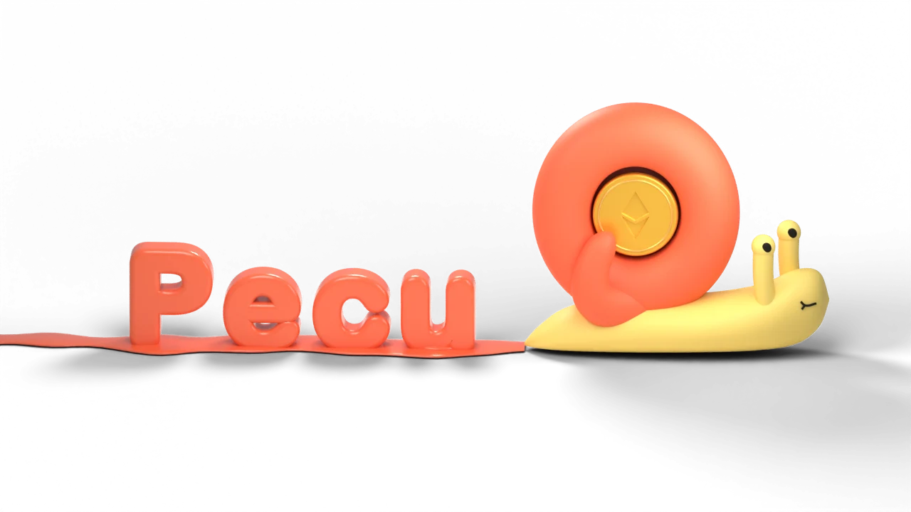
The snail keeps its original coral shell, butter body and gold coin. These colors belong to the artwork. Do not reintroduce them as a second UI theme.
The homepage Aero tile uses Aero's colors, not amber. The tile is Aero blue
with white text around a recessed terminal screen that shows the Aero mark.
theme/aero.css copies the values from the pinned @beegreat/sugar TUI: the
six ribbon colors from src/tui/logo.tsx, and the terminal background, text
and primary blue from src/tui/theme.ts. design:check fails when they
drift. Use the --aero-* tokens only inside .aero.
Always pair foreground and background tokens. Use readable text to explain pending, submitted, completed, cancelled and failed states. Color alone must not carry transaction status. Never invent live indicators or successful results.
The amber-minimal base radius stays unchanged. Pecu's explicit material tokens provide the larger shapes used by clay controls.
| Token | Use |
|---|---|
--clay-radius-control | 14px buttons and controls |
--clay-radius-surface | 22px composer and specimen surfaces |
--clay-radius-large | 30px large clay surfaces |
--clay-radius-pill | Capsule controls |
--clay-shadow-sm | Quiet raised controls |
--clay-shadow | Composer and floating panels |
--clay-shadow-primary | Amber actions and user bubbles |
--clay-shadow-inset | Recessed fields |
--clay-focus | Focus halo around the composer |
Keep highlights at the top left and shading at the bottom right. Shadows create the clay effect; do not add gradients, glow, glass or multiple competing accents. Do not flatten the controls when changing a theme token.
Use the theme's Inter sans-serif and JetBrains Mono stacks. Render amounts,
addresses and codes with tabular monospace figures. The wordmark is monospace
in --accent-foreground. Headings use sentence case and tight tracking.
| Role | Recipe |
|---|---|
| Homepage title | 36–64px, 750 weight, 1.04 line height |
| Section heading | 28–30px, 700 weight |
| Component heading | 19–24px, 650–700 weight |
| Body | 15–16px, 1.55–1.7 line height |
| Supporting text | 13–14px, muted foreground |
Prefer 8, 12, 16, 24 and 32px spacing. Keep primary actions at least 44px tall. Homepage tool cards form a bento. On desktop, Aero spans seven of twelve columns and both rows; Stocks and evmSDK stack beside it. Below 1000px Aero goes full width with its screen beside the copy, and below 760px every tile stacks. Tiles use 24px padding with the action row pinned to the bottom. The Aero screen sits 12px inside its tile. The homepage content is 1120px wide; the Agent conversation is capped at 940px. The desktop thread rail is 272px. Mobile uses the thread picker.
Use existing shadcn components under apps/stocks/src/components/ui and
AI Elements under components/ai-elements. Keep appearance in the component
or shared CSS recipe. Page code arranges components and supplies their data.
Primary actions use amber, dark text and the primary clay shadow. Secondary actions use card surfaces and the small clay shadow. Quiet actions have no shadow. Disabled and loading states must stay readable and prevent duplicate submission. Inputs keep labels and visible focus treatment.
Assistant replies flow on the page beside the snail. User messages use amber bubbles with dark text. The composer is a raised clay surface. Copy actions report success only after the clipboard write resolves and remain usable on touch devices. Thread selection changes immediately, with no sliding highlight.
Transaction cards use the amount-led clay layout selected from concept 05. Pay, estimated receive and spending limits lead; minimum received, destination, network and fees remain readable below. Full addresses wrap and can be copied. Never round away precision or invent a fee, quote, total or execution step. Unknown contract and liquidity fields remain visible as label/value rows.
Basket trades use the ledger direction from concept 08, with each minimum beside its own trade and shared fee information shown once. Approval cards use a recessed amount and explain the spending permission. Aave's supplied continuation instruction remains visible; concept 07 does not authorize inventing or automatically executing a second step. The existing backend owns confirmation and execution.
Every preview with a decoded plan ends its body with the route and the
transactions (TransactionPlan). The backend decodes the persisted calls, so
the card cannot show a step that will not run. The route sits on a recessed
--muted panel: tokens are clay pills, pools and protocols are 14px clay
tiles, and a pool the plan creates uses the amber tint with a dashed
--primary outline. Edges carry a chip with the transaction number and, for
swaps, the pool type (CL100, Volatile, Stable). An edge that skips a layer
arcs over the node between. The route flows left to right while it fits at 85%
scale or more and top to bottom below that, except wide fans such as baskets,
which stay across. Node text is HTML over the SVG, so it never scales. Below
the route, transactions form an ordered list: a numbered bead on a thin rail,
the decoded title, then the contract name, short address and copy control.
Approvals say Permission only and use a recessed bead. After confirmation each
step shows Waiting, Submitted, Confirmed on Base, Failed or Not sent, with its
own Basescan link; confirmed beads and rails fill amber and the card drops its
duplicate receipt links. Pointing at a transaction highlights its edges and dims
the rest. X Chat gets the same titles as a numbered Transactions: list.
Cards adapt to their container, including a narrow desktop chat pane. Below 380px of card content width, metadata and actions stack. On mobile the mascot sits above transaction cards so their content can use the conversation width. Primary actions are at least 48px tall. Long values wrap without truncation. Confirmation codes remain available in a disclosure.
Pending cards offer an action-specific Confirm and Cancel. Submission disables
both; submitted cards offer only Check transaction. Completed cards link to verified
receipts and distinguish original estimates from actual receipt data. Failed cards
retain the status-check warning. Expired/cancelled cards never expose Confirm.
The /design swap, approval, basket, new-pool and multi-hop examples render the
actual React component at build time with fictional fixtures; their controls only
change local page state.
Typing a slash opens command completion above the composer. Arrow keys move through options, Enter or Tab accepts, and Escape dismisses. Preserve listbox semantics and the custom text path.
The wallet shows one shortened address with a copy control. Copy uses the full address. The locally generated QR panel opens on hover or focus after one second, or immediately on tap, and closes with Escape, outside interaction or Close.
The address itself is the P&L control. Hover or keyboard focus opens a 296px
preview card after 400ms: total, realized and unrealized amounts, the three
largest movers and the Nansen source line. Clicking or tapping the address, or
the card's expand control, opens the full P&L page at #pnl. The page covers
the viewport with a 940px column: back control, 7D/30D/90D/1Y periods, the
total, a realized/unrealized split, signed bars for the eight largest movers
and every token in a table. Below 600px the table keeps Token and Total and
moves the realized and unrealized amounts under the total. Back, Escape and
browser Back close it and return focus to the address without reopening the
card. Basescan moved from the address to the page header. Amounts carry a +
or - sign, and losses also use the loss color. Tokens without a Nansen price
stay visible as Unavailable, and their missing values are left out of the
totals with a note.
The avatar at the end of the top bar opens the account menu, our own dropdown
rather than Clerk's: a 296px clay card with the person's photo or initials, name
and handle on a recessed strip, then Profile, My cards and ChatGPT connection,
a divider, Manage account and Sign out. Items are 44px rows with Lucide icons;
the highlighted row uses --secondary and the current page uses the accent
text color. It enters like the P&L card, 160ms with a 4px drop, and only fades
under reduced motion. Manage account opens Clerk's account settings. No Clerk
branding appears in the menu.
ChatGPT connection opens the same panel from the account menu or /agent#chatgpt.
Use the current connection controls only, with a 400px maximum panel width and
24px side padding. The device code and copy button share an inset field. Continue
uses the amber clay action; Cancel stays quiet. Do not expose credentials, raw
provider errors or invented quotas. Sign-in starts only on user action. Closing
returns to the conversation, and failures retain a retry action.
The wallet picker is one dialog shared by chat and profile: detected EIP-6963 wallets with their own icons, then WalletConnect with a QR icon. WalletConnect draws its own modal, so ours closes first. The connected wallet is a chip with its icon and short address; below 600px only the icon shows. Its popover shows the full address, Linked as NAME or Link to your account, and Disconnect. The Agent's wallet chip shows the thread's wallet with copy and a switch icon. The switch popover lists Pecu wallet and linked wallets as rows (name, short address, check on the active one), then Link a wallet and Disconnect for the browser wallet. There is no second picker in the composer. Linked previews say Review, then sign in your wallet, and Sent from your wallet, waiting for Base; they hide the confirmation code disclosure. Wallet notices sit under the card actions in muted 13px text, with Send again only for an unreported step.
/profile uses the Agent frame: the 272px rail on desktop and a navigation
dialog below 900px. The rail lists Chat, Profile, then each organization's
Safes. The active link is a raised card; organization names are muted 12px
labels. Content is a 940px column.
The profile page leads with one card: a 64px avatar, the person's name as the heading, their handle and Manage account, then a divider and the Pecu wallet with address, copy, Basescan, which sign-in it belongs to and a recessed stat strip of balances. Your wallets follows: linked wallets as raised rows with name, short address, copy, Basescan, Connected when this browser has it, and rename and unlink icons, plus Link a wallet. Organizations follow as clay cards with their Safes in a recessed list. With no organizations, one card explains what an organization is and offers New organization.
A Safe page shows the organization link, the Safe name with a rename control and the address. Receive opens the QR popover; New transaction is the amber action. The stat strip shows required approvals and balances once. Transactions, Owners and Settings use the recessed segmented control from the P&L periods, with the pending count on Transactions.
Each pending transaction is a large clay card: title, who proposed it and when, the plain-language summary, then approval beads, one per required approval, filled amber as owners approve. Below, a recessed list names every owner with Approved on Base, Signed or Waiting. The status line says how many approvals are missing, and whether executing from an owner wallet completes them. Actions only appear when the viewer can take them: Sign with the connected wallet, Approve or Execute with the Pecu wallet, Execute with the connected wallet, Reject and Remove from queue. A Pecu confirmation waiting on a transaction shows as an amber tint row with Review, which opens the transaction card in a dialog. History is a plain list with Executed links, Replaced and No longer pending.
Forms live in 480px dialogs: labelled recessed inputs, native selects, hints in muted 13px text, the amber submit and a quiet Cancel. Connect wallet lists EIP-6963 wallets with their own icons. Never show wallet or Pecu internals such as proposal hashes or nonces in normal text.
Use 160ms for control feedback, 180ms for mascot state crossfades and 200ms for
the desktop sidebar. The sidebar uses cubic-bezier(.77, 0, .175, 1); general
entrances use cubic-bezier(.23, 1, .32, 1). Animate transform and opacity.
Text must not scale. Thread selection and stock selection stay immediate.
The P&L card enters in 160ms with a 4px drop. The P&L page enters in 240ms
with a 12px rise and leaves in 160ms. Both use the entrance curve.
The Aero mark in pecu-assets/aero-mark.js is a canvas port of the TUI's
AeroMark. It keeps the half-block grid, 40ms frames, three-frame stagger,
cubic ease-out intro and the sweep every six seconds. The intro starts once
a third of the screen is visible. Pointer hover plays the sweep early. Playback
stops outside the viewport and while the document is hidden. Reduced motion
draws the finished mark with no intro or sweep.
Approval beads fill in 160ms. Profile tabs and navigation change immediately.
The transaction route draws in only while the plan is pending or executing. Nodes rise from 94% scale in 240ms on the entrance curve, edges draw in 420ms on the sidebar curve and chips fade in 200ms, each layer 140ms after the last. Then a short amber comet walks each unconfirmed edge on a linear 2.8s loop, offset 560ms per layer so value appears to travel through the route. Confirmed edges turn solid and stop. Settled cards stay still, comets pause off screen, and reduced motion shows the finished route with no motion.
Clay controls lift at most 2px on pointer hover and depress 1px on press. Respect reduced motion: remove movement and automatic video playback, use posters and immediate state changes. Pause mascot playback outside the viewport and when the document is hidden. Keep reduced-motion changes responsive.
Use the original transparent files in pecu-assets/mascot/. Idle and reveal
ship as VP9 WebM and HEVC with alpha, plus WebP posters. Safari uses HEVC tagged
hvc1; playback or decode failure falls back to the poster. Use the same codec
selection logic as the homepage. Never place the snail on an amber background.
The reveal plays once and holds its final frame. Idle may loop where an active mascot is useful. The conversation loader is centered in the conversation, not the whole page, and has a static reduced-motion frame. Loading errors replace it with a retry action. Keep settled chat avatars static.
The side-eye snail is the favicon and app icon. UI controls use Lucide icons
with currentColor. Preserve the original artwork and third-party brand marks.
/docs uses the homepage stylesheet plus pecu-assets/docs.css. The header
holds the wordmark, a recessed product switch for Pecu, Aero and evmSDK, and
search. Wide screens use three columns: a 248px page rail, a 760px article and
a 216px outline. Below 1180px the outline becomes an "On this page" disclosure
in the article. Below 900px the page rail moves into a drawer that also holds
the product switch.
The current page uses the amber tint with accent text. Outline highlighting
follows scroll position and changes immediately. Code blocks are recessed
--dark terminal surfaces. Shiki's CSS-variables theme maps tokens to amber
tints on that surface, so highlighting stays inside the theme. Copy reports
success only after the clipboard write resolves. Warning callouts use the
amber tint, like the homepage notice; notes and tips use --muted.
The docs landing reuses the homepage tiles: the dark Pecu tile with the still
snail, the Aero tile with its palette and mark, and the muted evmSDK tile. They
rise in once with the homepage stagger. Search opens instantly from the header,
/ or Cmd/Ctrl+K, with no animation, because keyboard-opened panels must not
wait. The drawer slides in 200ms on the sidebar curve and fades under reduced
motion. Previous and next cards lift 2px on pointer hover.
Use plain words and human token amounts. Do not show machine IDs, raw JSON, calldata or framework names in ordinary replies. Keep source paths in the design reference, where they help developers locate components.
Keep visible focus rings, accessible names for icon buttons, labelled fields, and live regions for asynchronous feedback. Primary controls need 44px targets. Hide scrollbars while preserving wheel, touch, keyboard and trackpad scrolling. No custom scrollbar tracks. Tables can scroll inside their own container; the page must not overflow horizontally.
The non-affiliation notice from packages/sugar/README.md belongs on pages that
mention Aerodrome. Preserve third-party licenses and notices.
Run bun run --cwd apps/pecu design:check. It checks the generated theme against
the pinned JSON, confirms that both apps import the shared theme and clay files,
compares theme/aero.css with the pinned Aero TUI, and runs @shadcn/lint
through Oxlint on the React source.
The shadcn rules reject raw palette colors and inline color, shadow and font
changes. The CSS check rejects new literal colors and local theme overrides in
the homepage, Agent and design-reference styles. Clay effects are explicitly
allowed through theme/clay.css. Asset masks and dark artwork details have
narrow documented exceptions.
The linter cannot judge composition or prove visual consistency. Check the
homepage, Agent, connection dialogs and /design on desktop and mobile after
changes. Test focus, disabled states, reduced motion and local sample controls.
To change the upstream theme, update the pinned JSON deliberately, regenerate,
review the token diff, and run the checks. Builds never fetch a moving theme URL.
The component file catalog refreshes automatically; new visual patterns also
need a specimen in apps/site/scripts/build-design.ts.
Stock holdings open on the dotted pie. Graph and List are two 32px icon buttons in a recessed pill right after the Stock holdings title, with the total on the far right. List rows carry no color dots; only the graph legend has color swatches, as small squares.
Dither chart internals and stock-holdings.tsx are exempt from the inline-style
rule because chart geometry and series colors come from data. Raw Tailwind color
and arbitrary color checks still apply there. Aero Stocks' standalone blue
workspace is outside this Pecu homepage/Agent theme change.
Use NansenChart for typed flow, P&L and portfolio snapshots. Dither bars retain a zero baseline and negative values. Allocation pies use priced positive assets, with exact accessible rows below. Realized/unrealized and wallet/DeFi controls change local views without API calls. Do not animate financial amounts or add bloom. Keep missing values distinct from zero, disclose partial results, and retain the Nansen source link and retrieval time. Wallet balances and DeFi assets must not be summed. Interactive examples: /nansen-showcase on pecu.app.
Use PolymarketCard for typed Polymarket snapshots, and AnalyticsCard wherever a
reply can hold either source. Cards share the Nansen card shell: title, one muted
meta line, content, then the source link and retrieval time. Odds are percentages
with a primary bar on a muted track; order book prices are cents per share, and
sizes are shares. Bids use a light primary fill and asks a muted fill, always under
Bids and Asks headings. Price history and trader P&L use the dotted Dither area
chart with no bloom. Signed P&L uses +/- and the loss color. Lists show six to
eight rows with Show all. Empty reads say so instead of drawing an empty chart.
Interactive examples: /polymarket-showcase on pecu.app.
The shared account menu opens My cards in the existing dialog. Show owned Blender card artwork with transparent surroundings, the card name, and copy count only above one. A newly granted card opens the dialog with a short fade and upward movement; reduced motion disables that entrance. Keep loading, retry, exhausted-drop, and connect-X states in the same dialog. The card is an actual 3D model with drag rotation, zoom, turn-over and reset controls. Arrow keys turn it, plus/minus zoom, and Home resets. There is no automatic spin. Closing it clears the cards hash and disposes the viewer. Cards persist after X disconnects.
Automations open from a header chip on web and the account menu on Android. Each automation is one raised card: title, a muted line with its kind, schedule and next run, the saved instruction, then its allowance as one sentence on a recessed panel. A requested or expired allowance uses the amber tint with a USD per run field and a primary Approve action. Row actions are quiet text buttons; delete asks first. Messages an automation wrote replace the user bubble with a small muted line holding the automation title, so they never look like something the user typed.